Here is an example of plotting SAC files in Python. The sample SAC files can be downloaded here and the Jupyter notebook can be downloaded here.
First, import some useful packages, including obspy, pandas, numpy and Basemap. By the way, they are all great packages (obspy is amazing for anyone who uses seismic data)
from obspy import read
import pandas as pd
from mpl_toolkits.basemap import Basemap
import matplotlib.pyplot as plt
import numpy as np

#Ignore warnings due to python 2 and 3 conflict
import warnings
warnings.filterwarnings("ignore")
Let’s read the sample Z component using read from obspy
stream = read("2015.0529.0700/*Z.sac")
In here, we use the header from SAC file using tr.stats.sac.(SAC_header)
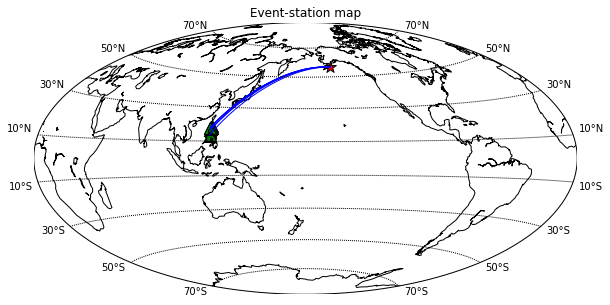
plt.figure(figsize=(10,5))
# setup mercator map projection.
m = Basemap(lon_0=180,projection='hammer')
evlat = stream[0].stats.sac.evla; evlon = stream[0].stats.sac.evlo

#Plot the event
xx,yy = m(evlon,evlat)
m.scatter(xx, yy, marker = "*" ,s=150, c="r" , edgecolors = "k", alpha = 1)

for tr in stream:
    stlat = tr.stats.sac.stla; stlon = tr.stats.sac.stlo
    m.drawgreatcircle(stlon,stlat,evlon,evlat,linewidth=1,color='b')
    xx,yy = m(stlon,stlat)
    m.scatter(xx, yy, marker = "^" ,s=150, c="g" , edgecolors = "k", alpha = 1)

m.drawcoastlines()
#m.fillcontinents()
m.drawparallels(np.arange(-90,90,20),labels=[1,1,0,1])
plt.title("Event-station map")
plt.show()
I used a simple trick to plot the seismogram with distance by make the y:
y = data + dist*weight_factor
with data is the amplitude of seismic trace, dist: distance in km (SAC header) and weight_factor = 0.01
The red line indicate the predicted P arrival time that I have calculated and store in SAC header t3
plt.figure(figsize=(10,5))
for tr in stream:
    tr.normalize()
    dist = tr.stats.sac.dist
    plt.plot(tr.times(),tr.data+dist*0.01,c="k",linewidth=0.5)
    plt.scatter(tr.stats.sac.t3,dist*0.01,marker="|",color="r")
plt.ylabel("x100 km")
plt.ylim(84,77)
plt.xlim(650,800)
plt.show()

plt.figure(figsize=(10,5))
for tr in stream:
    tr.normalize()
    dist = tr.stats.sac.dist*0.01
    x = tr.times()
    y = tr.data+dist
    plt.fill_between(x,y, dist, y > dist, color='r', alpha = 0.8)
    plt.fill_between(x,y, dist, y < dist, color='b', alpha = 0.8)
plt.ylabel("x100 km")
plt.ylim(84,77)
plt.xlim(650,800)
plt.show()

Nguyen Cong Nghia
IESAS
