Refer to Chapter 4 of Shearer, Introduction to Seismology.
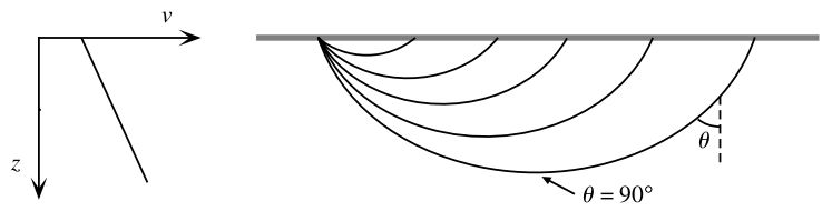
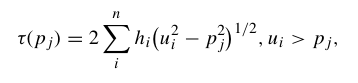
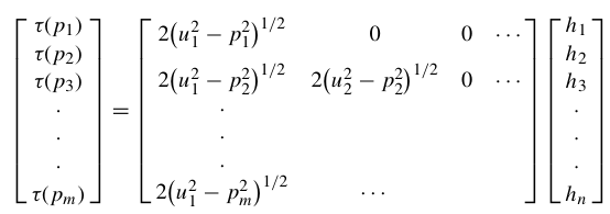
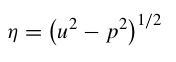
For a ray piercing through Earth, the ray parameter (or horizontal slowness) p is defined by several expressions:
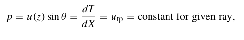
where u = 1/v is the slowness, θ is the ray incidence angle, T is the travel time, X is the horizontal range and utp is the slowness at the ray turning point.
The vertical slowness is defined as:
and integral expressions for the surface-to-surface travel time are:
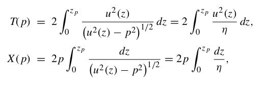

With these equations we can calculate the travel time (T) and horizontal distance (X) for a given ray with ray parameter p and velocity model v(z).
Apply these to a problem (Exercise 4.8 Shearer):
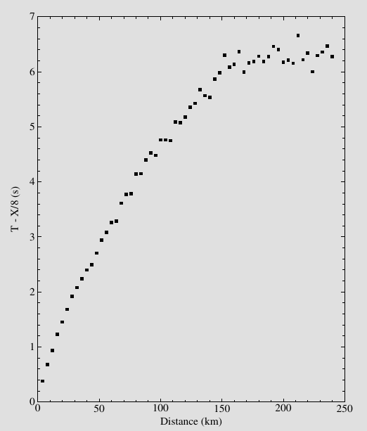
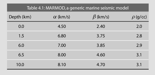
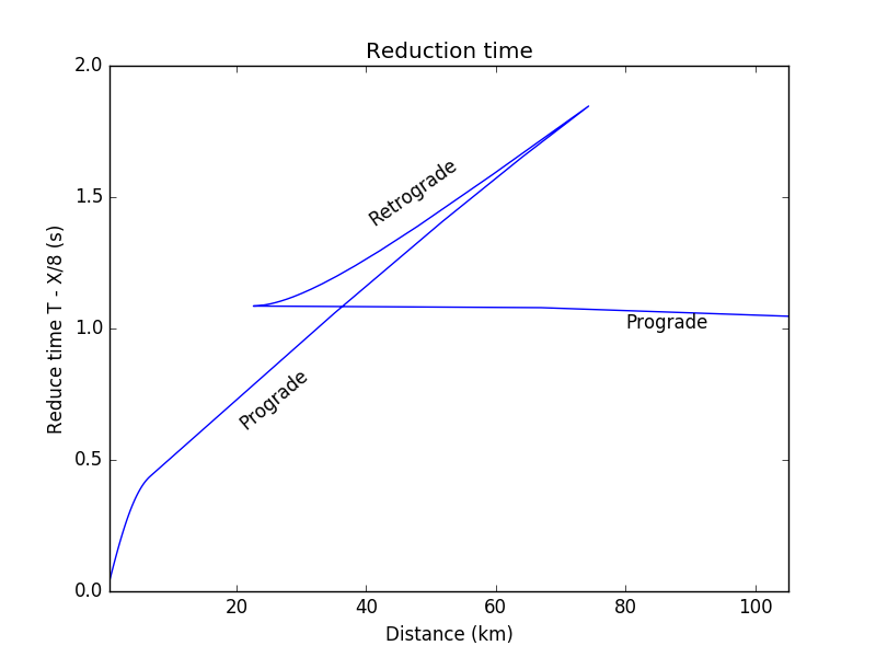
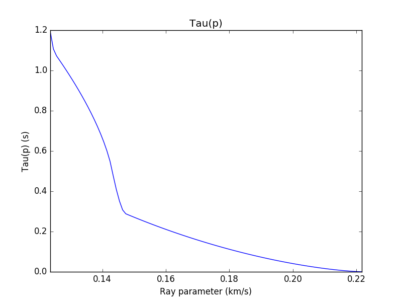
(COMPUTER) Consider MARMOD, a velocity-versus-depth model, which is typical of much of the oceanic crust (Table 4.1). Linear velocity gradients are assumed to exist at intermediate depths in the model; for example, the P velocity at 3.75 km is 6.9 km/s. Write a computer program to trace rays through this model and produce a P-wave T(X) curve, using 100 values of the ray parameter p equally spaced between 0.1236 and 0.2217 s/km. You will find it helpful to use subroutine LAYERXT (provided in Fortran in Appendix D and in the supplemental web material as a Matlab script), which gives dx and dt as a function of p for layers with linear velocity gradients. Your program will involve an outer loop over ray parameter and an inner loop over depth in the model. For each ray, set x and t to zero and then, starting with the surface layer and proceeding downward, sum the contributions, dx and dt, from LAYERXT for each layer until the ray turns. This will give x and t for the ray from the surface to the turning point. Multiply by two to obtain the total surface-to-surface values of X(p) and T(p). Now produce plots of: (a) T(X) plotted with a reduction velocity of 8 km/s, (b) X(p), and (c) τ(p). On each plot, label the prograde and retrograde branches. Where might one anticipate that the largest amplitudes will occur?
Using the LAYERXT subroutine (Appendix D of Shearer), the FORTRAN and MATLAB can be downloaded from here. In this example, we will use python to calculate and plot the result.

The main program is as follow:
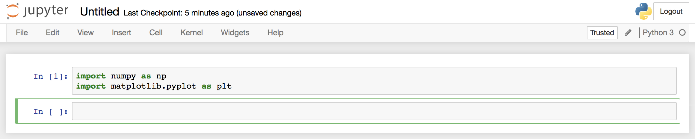
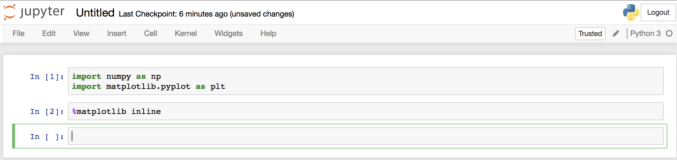
from ttcal import layerxt
import pandas as pd
import numpy as np
import matplotlib.pyplot as plt
v_model = pd.read_csv('v_model.dat')
p1 = 0.1236
p2 = 0.2217
n = 100
result = [['p','X','T']]
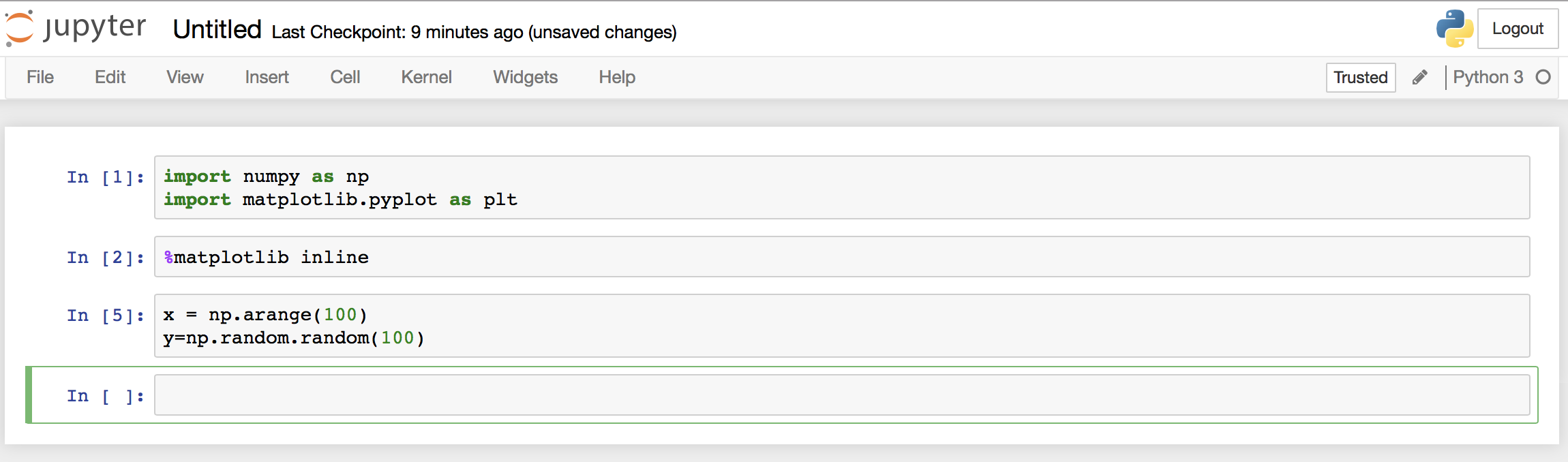
for p in np.linspace(p1, p2, n):
X = 0; T = 0;
for i in range(0, len(v_model)-1):
p = p
h = v_model.h[i+1] - v_model.h[i]
utop = 1/v_model.vp[i]
ubot = 1/v_model.vp[i+1]
dx, dt, irtr = layerxt(p,h,utop,ubot)
X += dx; T += dt
#If the ray reflected at layer the dx, dt calculation stops
if irtr == 2:
break
result.append([p,X,T])
result_df = pd.DataFrame(result, columns=result.pop(0))
result_df = result_df[::-1]
#Multiply by 2 to get total surface-to-surface value ot X(p) and T(p)
result_df['T'] = 2*result_df['T']
result_df['X'] = 2*result_df['X']
plt.figure(1)
result_df['RT'] = result_df['T']-result_df['X']/8
result_df.plot(x='X', y='RT', legend=False)
plt.title('Reduction time')
plt.ylabel('Reduce time T - X/8 (s)')
plt.xlabel('Distance (km)')
plt.text(20,0.80,'Prograde', rotation =40)
plt.text(40,1.6,'Retrograde', rotation =35)
plt.text(80,1.00,'Prograde', rotation =0)
plt.savefig('ex4.8.1.png')
plt.figure(2)
result_df.plot(x='p', y='X', legend=False)
plt.title('X(p)')
plt.ylabel('Distance X (km)')
plt.xlabel('Ray parameter (km/s)')
plt.xlim([p1,p2])
plt.savefig('ex4.8.2.png')
plt.figure(3)
result_df['Taup'] = result_df['T'] - result_df['p']*result_df['X']
result_df.plot(x='p', y='Taup', legend=False)
plt.title('Tau(p)')
plt.ylabel('Tau(p) (s)')
plt.xlabel('Ray parameter (km/s)')
plt.xlim([p1,p2])
plt.savefig('ex4.8.3.png')
plt.figure(4)
v_model.h = v_model.h * (-1)
v_model.plot(x='vp', y='h', legend=False)
plt.ylabel('Depth (km)')
plt.xlabel('Velocity (km/s)')
plt.xlim([4,9])
plt.ylim([-10,0])
plt.savefig('ex4.8.4.png')
#plt.show()
LAYERXT subroutine written in python:
from math import sqrt, log


def layerxt(p,h,utop,ubot):
    ''' LAYERXT calculates dx and dt for ray in layer with linear velocity gradient

        Inputs:   p     =  horizontal slowness
             h     =  layer thickness
             utop  =  slowness at top of layer
             ubot  =  slowness at bottom of layer
        Returns:  dx    =  range offset
             dt    =  travel time
             irtr  =  return code
                   = -1,  zero thickness layer
                   =  0,  ray turned above layer
                   =  1,  ray passed through layer
                   =  2,  ray turned within layer, 1 segment counted in dx,dt'''
# ray turned above layer
    if p >= utop:
        dx = 0
        dt = 0
        irtr = 0
        return dx,dt,irtr

#Zero thickness layer
    elif h == 0:
        dx = 0
        dt = 0
        irtr = -1
        return dx,dt,irtr

#Calculate some parameters
    u1 = utop
    u2 = ubot
    v1 = 1.0/u1
    v2 = 1.0/u2
#Slope of velocity gradient
    b = (v2 - v1)/h
    eta1 = sqrt(u1**2 - p**2)

#Constant velocity layer
    if b == 0:
        dx = h*p/eta1
        dt = h*u1**2/eta1
        irtr = 1
        return dx,dt,irtr

    x1 = eta1/(u1*b*p)
    tau1=(log((u1+eta1)/p)-eta1/u1)/b

#Ray turned within layer, no contribution to integral from bottom point
    if p >= ubot:
        dx = x1
        dtau = tau1
        dt = dtau + p*dx
        irtr = 2
        return dx,dt,irtr

        irtr=1
    eta2=sqrt(u2**2-p**2)
    x2=eta2/(u2*b*p)
    tau2=(log((u2+eta2)/p)-eta2/u2)/b

    dx=x1-x2
    dtau=tau1-tau2

    dt=dtau+p*dx
    return dx,dt,irtr

def flat(zsph,vsph):
    ''' Calculate the flatten transformation from a spherical Earth.
        zf, vf = flat(zsph,vsph)'''

# Radius of the Earth
    a = 6371.0

    rsph = a - zsph
    zf = -a*log(rsph/float(a))
    vf = (a/float(rsph))*vsph
    return zf, vf
Input velocity model:
h,vp,vs,den
0.0,4.5,2.4,2
1.5,6.8,3.75,2.8
6.0,7.0,3.5,2.9
6.5,8.0,4.6,3.1
10.0,8.1,4.7,3.1
The codes can be downloaded here: main program, python LAYERXT subroutine, velocity model.
You need to install numpy, pandas and matplotlib package to run this. Normally it can be installed in the terminal by (presume python has been installed):
pip install numpy pandas matplotlib
Nguyen Cong Nghia – IESAS


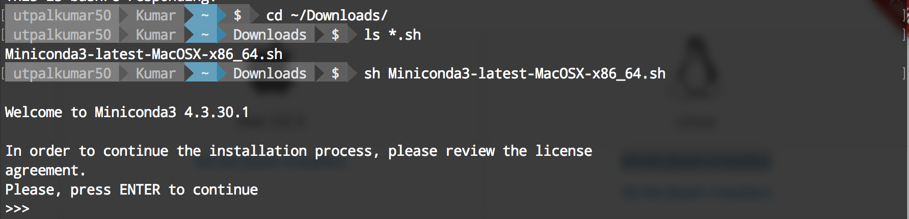
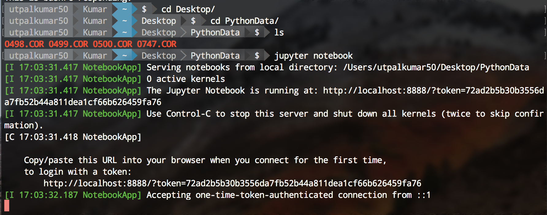 Jupyter notebook can be started using the terminal. Firstly, navigate to your directory containing the data and the type “jupyter notebook” on your terminal.
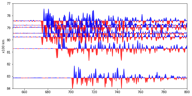
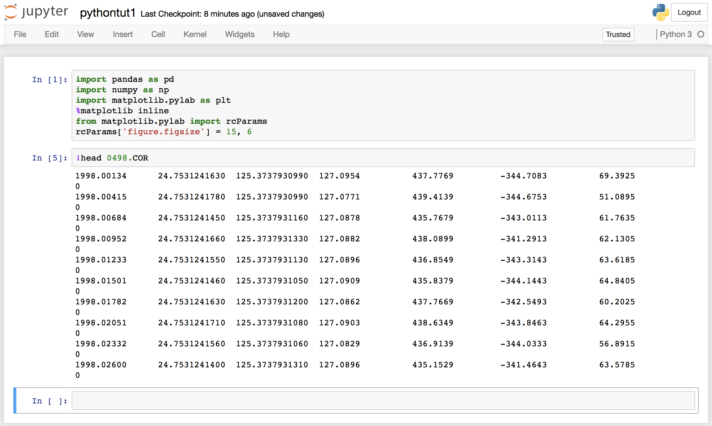 We can see that the data has no header information, and 8 columns. The columns are namely, “year”, “latitude”, “longitude”, “Height”, “dN”, “dE”, “dU”.
 Our data is now loaded, and if we want to extract any section of the data, we can easily do that.
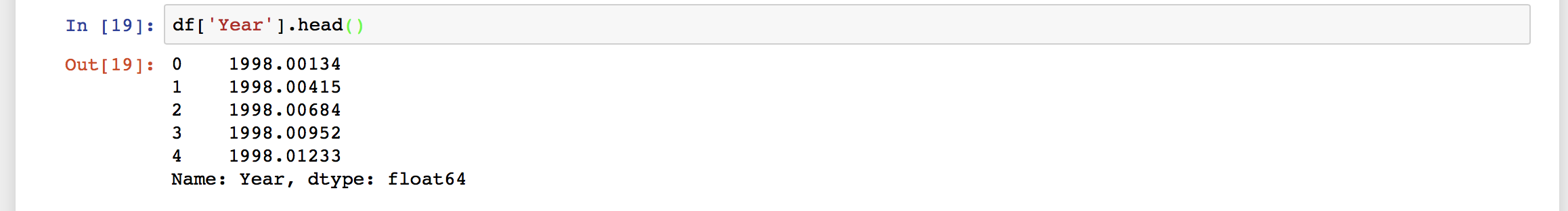
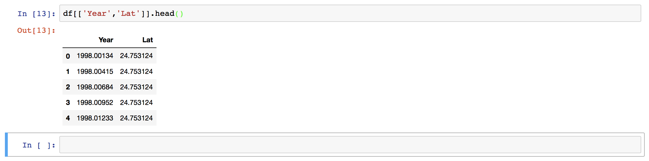 Here, we have used the column names to extract the two columns only. We can also use the index values.
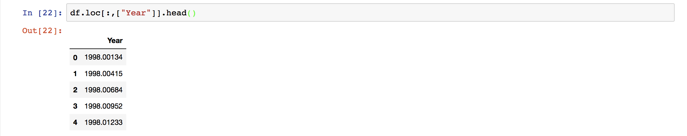
 When we use “.loc” method to extract the section of the data, then we need to use the column name whereas when we use the “.iloc” method then we use the index values. Here,
 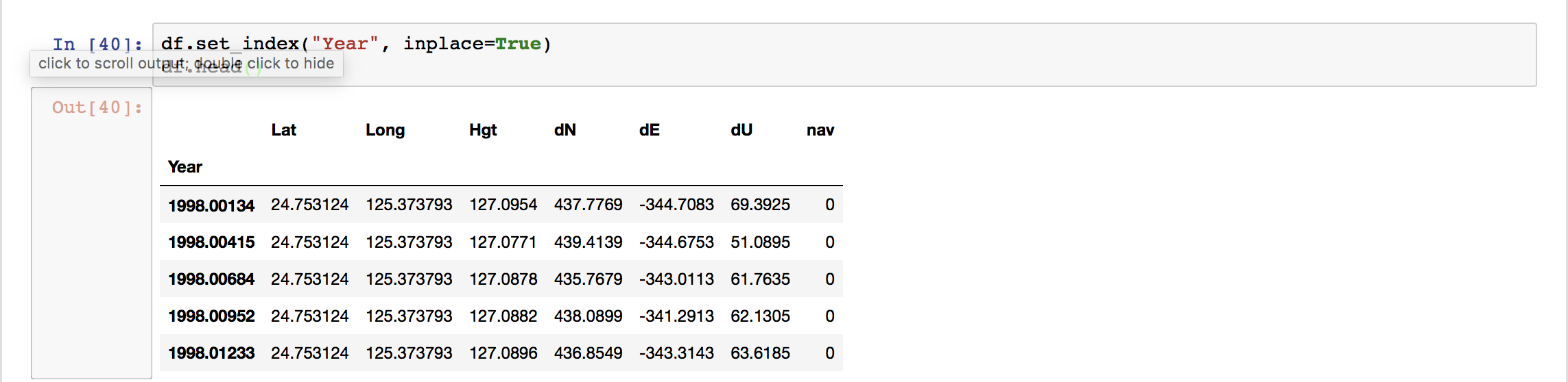 We can see the “Year” column as the index of the data frame now. Plotting using Pandas is extremely easy.
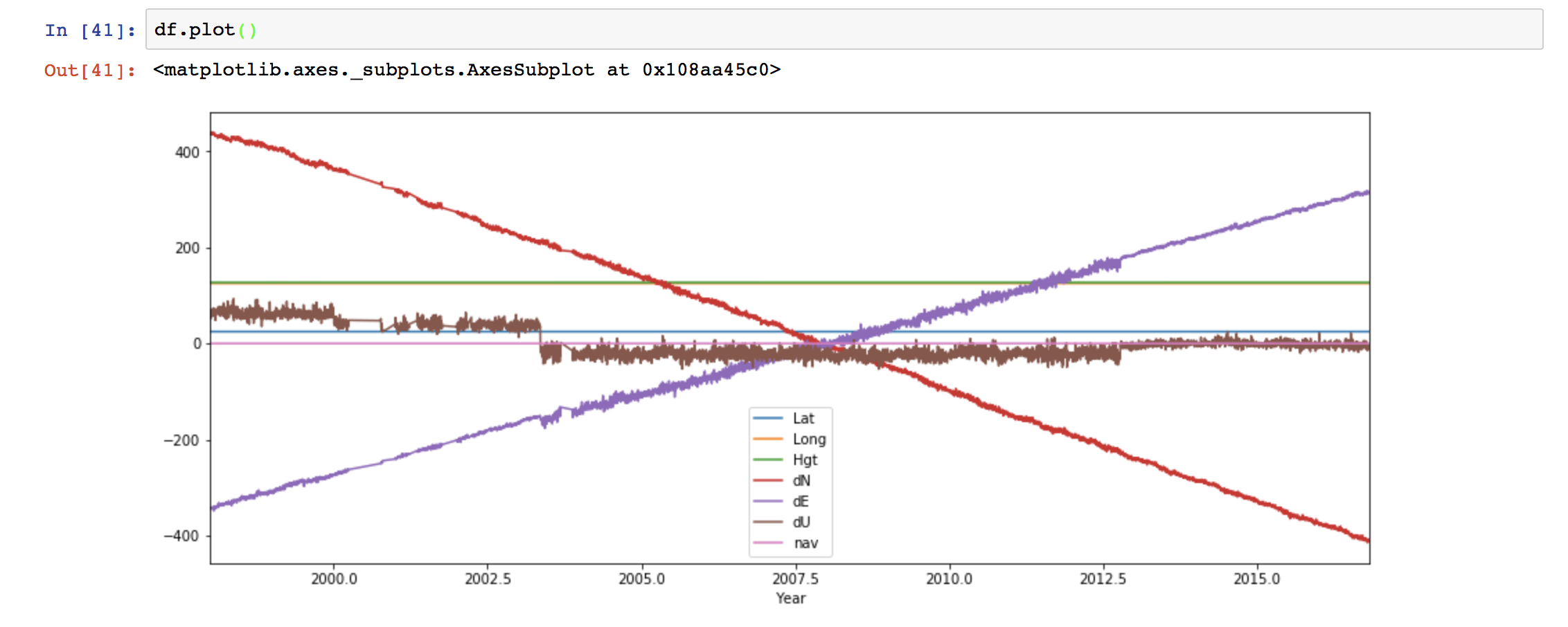 We can also customize the plot easily.
 If we want to save the figure, then we can use the command:
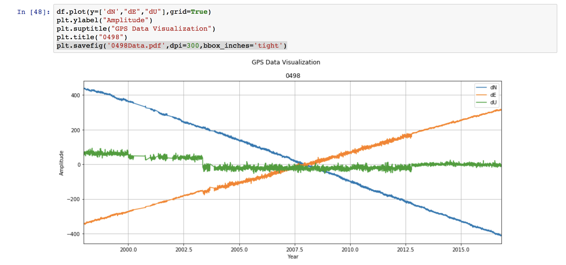 This saves the figure as the pdf file named “0498Data.pdf”. The format can be set to any type “.png”, “.jpg”, ‘.eps”, etc. We set the resolution to be 300 dpi. This can be varied depending on our need. Lastly, “bbox_inches =‘tight’” crops our figure to remove all the unnecessary space.

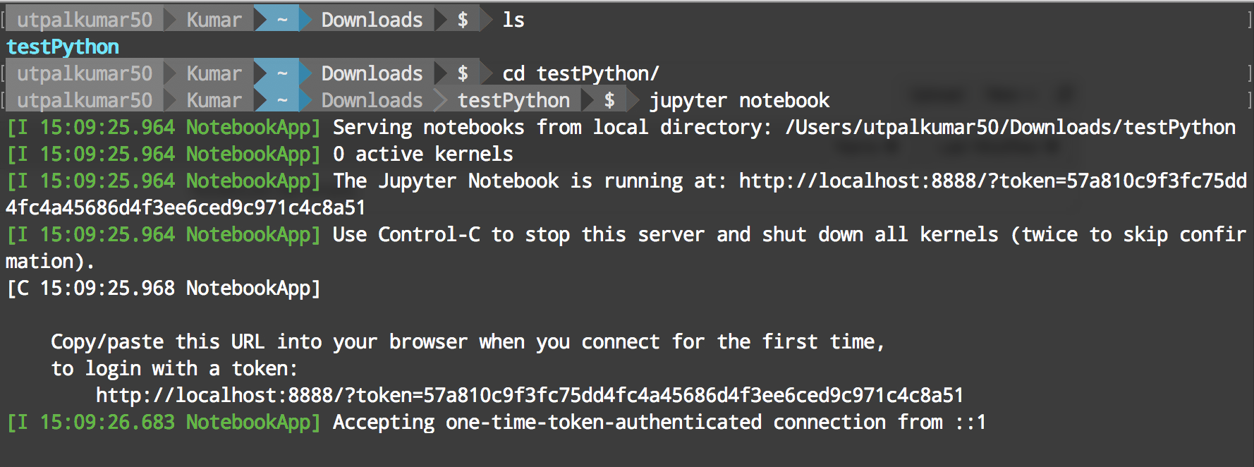
 It will open “Jupyter” in your favorite browser.