Generators don’t hold the entire result in memory. It yields one result at a time.
Ways of creating generators:
Using a function
def squares_gen(num):
        for i in num:
                yield i**2
def squares(num):
                results=[]
                for i in num:
                        results.append(i**2)
                return results
Elapsed time for list: 7.360722 Seconds
Elapsed time for generators: 5.999999999950489e-06 Seconds
Difference in time taken for the list and generators: 7.360716 Seconds for num = np.arange(1,10000000)
Using comprehension
resl = [i**2 for i in num]
resg = (i**2 for i in num)
Elapsed time for list: 7.663468000000001 Seconds
Elapsed time for generators: 9.999999999621423e-06 Seconds
Difference in time taken: 7.663458000000001 Seconds for num = np.arange(1,10000000)
Obtaining results from the generator object:
Using next
resg = squares_gen(num)
		print('res of generators: ',next(resg))
		print('res of generators: ',next(resg))
		print('res of generators: ',next(resg))
2.Using loop:
for n in resg:
		    print(n)
Advantages of using generators:
The generator codes are more readable.
Generators are much faster and uses little memory.
Results:
Using function is a faster way of creating values in Python than using loop or list comprehension for both lists and generators.
The difference between using list or generators is more pronounced when using a comprehension (though generators are still much faster.)
When we need the result of whole array at a time then the amount of time (or memory) taken to create a list or list(generators) are almost same.
Overall, generators gives a performance boost not only in execution time but with the memory as well.
Appendix
How I calculated the time taken by the process
Calculate sum of the system and user CPU time of the current process.
time.process_time provides the system and user CPU time of the current process in seconds.
Use time.process_time_ns to get the result in nanoseconds
NOTE: The “time taken” shown in this study is subjective to different computers and varies each time depending on the state of the CPU. But each and everytime, the using generators are much faster.
Recently, we have joined hackathons and tried making web applications using Python. We intend to make tutorials on making these web apps. In this introduction, we present what we have done.
MATLAB and Python are both well known for its usefulness in the scientific computing world. There are several advantages of using one over another. Python is preferable for most of the programmers because it’s free, beautiful, and powerful. MATLAB, on the other hand, has advantages like there is the availability of a solid amount of functions, and Simulink. Both the languages have a large scientific community and are easier to learn for the beginners. Though MATLAB, because it includes all the packages we need is easier to start with than the Python where we need to install extra packages and also require an IDE. The proprietary nature of the algorithms in MATLAB i.e., we cannot see the codes of most of the algorithms and we have to trust them to implement for our usage makes us sometimes hard to prefer MATLAB over the other options available like Python. Besides, these proprietary algorithms of MATLAB come at a cost!
In short, in order to excel in all of our scientific tasks, we need to learn to utilize both of them interchangeably. This is where Python’s module SciPy comes in handy. MATLAB reads its proprietary “mat” data format quite efficiently and fastly. The SciPy’s module, “loadmat” and “savemat” can easily read and write the data stored in the Python variable into the “mat” file, respectively. Here, we show an example to use the data from MATLAB in the “mat” format to plot in Python on a geographical map, which Python can execute much efficiently than MATLAB.
Saving the MATLAB variables into a “mat” file
In this example MATLAB script, we show how can we read the “mat” file in the MATLAB script and save it.
clear; close all; clc

%% Load the two matfiles with some data into the workspace
load python_export_CME_ATML_orig_vars;
load station_info;

%% Remove the unrequired variables from the MATLAB's memory
clearvars slat slon;

%% Saving the data from the "station_info.mat" file as a cell data type
stns={slons' slats' stn_name'};

%% Conduct some operations with the data and save it in "admF" variable
admF=[]; %intializing the matrix
std_slU=std(slU);
for i=1:length(slons)
    ccU=corrcoef(dU(:,i),slU); %Making use of the available MATLAB functions
    std_dU=std(dU(:,i));
    admF=[admF ccU(1,2)*(std_dU/std_slU)];
end

%% Saving the output "admF" matrix into the "MATLAB_export_admittance_output.mat" file at a desired location.
save('../EOF_python/MATLAB_export_admittance_output.mat','admF')
Using the data from the “mat” file in Python to plot on a geographical map
import scipy.io as sio #importing the scipy io module for reading the mat file
import numpy as np #importing numpy module for efficiently executing numerical operations
import matplotlib.pyplot as plt #importing the pyplot from the matplotlib library
from mpl_toolkits.basemap import Basemap #importing the basemap to plot the data onto geographical map
from matplotlib import rcParams
rcParams['figure.figsize'] = (10.0, 6.0) #predefine the size of the figure window
rcParams.update({'font.size': 14}) # setting the default fontsize for the figure
from matplotlib import style
style.use('ggplot') # I use the 'ggplot' style for plotting. This is optional and can be used only if desired.

# Change the color of the axis ticks
def setcolor(x, color):
     for m in x:
         for t in x[m][1]:
             t.set_color(color)

# Read the two mat files and saving the MATLAB variables as the Python variables
ADF = sio.loadmat('MATLAB_export_admittance_output.mat')
admF=np.array(ADF['admF'])[0]

STN = sio.loadmat('station_info.mat')
slon=np.array(STN['slons'])[0]
slat=np.array(STN['slats'])[0]

## Converting MATLAB cell type to numpy array data type
stnname=np.array(STN['stn_name'])[0]
sname=[]
for ss in stnname:
    sname.append(ss[0])
sname=np.array(sname)

## Plotting the admittance values
plt.figure()
offset=0.5
m = Basemap(llcrnrlon=min(slon)-offset,llcrnrlat=min(slat)-offset,urcrnrlon=max(slon)+offset,urcrnrlat=max(slat)+offset,
        projection='merc',
        resolution ='h',area_thresh=1000.)
xw,yw=m(slon,slat) #projecting the latitude and longitude data on the map projection

m.drawmapboundary(fill_color='#99ffff',zorder=0) #plot the map boundary
m.fillcontinents(color='w',zorder=1) #fill the continents region
m.drawcoastlines(linewidth=1,zorder=2) #draw the coastlines
# draw parallels
par=m.drawparallels(np.arange(21,26,1),labels=[1,0,0,0], linewidth=0.0)
setcolor(par,'k') #The color of the latitude tick marks has been set to black (default) but can be changed to any desired color
# draw meridians
m.drawmeridians(np.arange(120,123,1),labels=[0,0,0,1], linewidth=0.0)

cax=m.scatter(xw,yw,c=admF,zorder=3,s=300*admF,alpha=0.75,cmap='viridis') #plotting the data as a scatter points on the map
cbar = m.colorbar(cax) #plotting the colorbar
cbar.set_label(label='Estimated Admittance Factor',weight='bold',fontsize=16) #customizing the colorbar
plt.savefig('all_stations_admittance.png',dpi=200,bbox_inches='tight') #saving the best cropped output figure as a png file with resolution of 200 dpi.
We download the precompiled data of adakite from GEOROC database.
For a simple impression of adakite, the wikipedia page gives some clue: Adakites are volcanic rocks of intermediate to felsic composition that have geochemical characteristics of magma thought to have formed by partial melting of altered basalt that is subducted below volcanic arcs.
In this example, we demonstrate how to use python to simplify the data, discard the null data, classify and plot the geochemical properties.
First, let’s look at the data, it is quite large and differs in the available data: some elements are there, some are not.
Now we can start by importing some useful packages:
… and then plot some elements using that function:
plt.figure(figsize=(12,12))plt.subplot(321)plot_harker(x=df["SIO2(WT%)"],xlabel=r'$SiO_2$ (wt%)',y=df["AL2O3(WT%)"],ylabel=(r'$Al_2O_3$ (wt%)'),title=r'$SiO_2$ vs $Al_2O_3$')plt.subplot(322)plot_harker(x=df["SIO2(WT%)"],xlabel=r'$SiO_2$ (wt%)',y=df["MGO(WT%)"],ylabel=(r'$MgO$ (wt%)'),title=r'$SiO_2$ vs $MgO$')plt.subplot(323)plot_harker(x=df["SIO2(WT%)"],xlabel=r'$SiO_2$ (wt%)',y=df["FEOT(WT%)"],ylabel=(r'$FeOt$ (wt%)'),title=r'$SiO_2$ vs $FeOt$')plt.subplot(324)plot_harker(x=df["SIO2(WT%)"],xlabel=r'$SiO_2$ (wt%)',y=df["TIO2(WT%)"],ylabel=(r'$TiO_2$ (wt%)'),title=r'$SiO_2$ vs $TiO_2$')plt.subplot(325)plot_harker(x=df["SIO2(WT%)"],xlabel=r'$SiO_2$ (wt%)',y=df["NA2O(WT%)"],ylabel=(r'$Na_2O$ (wt%)'),title=r'$SiO_2$ vs $Na_2O$')plt.subplot(326)plot_harker(x=df["SIO2(WT%)"],xlabel=r'$SiO_2$ (wt%)',y=df["K2O(WT%)"],ylabel=(r'$MgO$ (wt%)'),title=r'$SiO_2$ vs $K_2O$')plt.suptitle(r'Harker diagram of Adakite vs $SiO_2$',y=0.92,fontsize=15)plt.subplots_adjust(hspace=0.3)plt.show()
We can try to see the tectonic settings of the rock:
plt.figure(figsize=(8,8))tec=df['TECTONIC SETTING'].dropna()tec=tec.replace('ARCHEAN CRATON (INCLUDING GREENSTONE BELTS)','ARCHEAN CRATON')tec_counts=tec.value_counts()tec_counts.plot(kind="bar",fontsize=10)plt.title('Tectonic settings of Adakite')plt.ylim([0,500])plt.show()
The following code demonstrates how to create new columns and divide the data. We divide the data in High Silica Adakite (SiO2 > 60%) and Low Silica Adakite (SiO2 < 60%)
For how to read a netCDF data, please refer to the previous post. Also, check the package and tools required for writing the netCDF data, check the page for reading the netCDF data.
Importing relevant libraries
import netCDF4
import numpy as np
Let us create a new empty netCDF file named “new.nc” in the “../../data” directory and open it for writing.
Notice here that we have set the mode to be “w”, which means write mode. We can also open the data in append mode (“a”). It is safe to check whether the netCDF file has closed, using the try and except statement.
Creating Dimensions
We can now fill the netCDF files opened with the dimensions, variables, and attributes. First of all, let’s create the dimension.
lat_dim = ncfile.createDimension('lat', 73) # latitude axislon_dim = ncfile.createDimension('lon', 144) # longitude axistime_dim = ncfile.createDimension('time', None) # unlimited axis (can be appended to).for dim in ncfile.dimensions.items(): print(dim)
Every dimension has a name and length. If we set the dimension length to be 0 or None, then it takes it as of unlimited size and can grow. Since we are following the netCDF classic format, only one dimension can be unlimited. To make more than one dimension to be unlimited follow the other format. Here, we will constrain to the classic format only as it is the simplest one.
Creating attributes
One of the nice features of netCDF data format is that we can also store the meta-data information along with the data. This information can be stored as attributes.
ncfile.title='My model data'print(ncfile.title)
ncfile.subtitle="My model data subtitle"ncfile.anything="write anything"print(ncfile.subtitle)print(ncfile)print(ncfile.anything)
We can add as many attributes as we like.
Creating Variables
Now, let us add some variables to store some data in them. A variable has a name, a type, a shape and some data values. The shape of the variable can be stated using the tuple of the dimension names. The variable should also contain some attributes such as units to describe the data.
lat = ncfile.createVariable('lat', np.float32, ('lat',))lat.units = 'degrees_north'lat.long_name = 'latitude'lon = ncfile.createVariable('lon', np.float32, ('lon',))lon.units = 'degrees_east'lon.long_name = 'longitude'time = ncfile.createVariable('time', np.float64, ('time',))time.units = 'hours since 1800-01-01'time.long_name = 'time'temp = ncfile.createVariable('temp',np.float64,('time','lat','lon')) # note: unlimited dimension is leftmosttemp.units = 'K' # degrees Kelvintemp.standard_name = 'air_temperature' # this is a CF standard nameprint(temp)
Here, we create the variable using the createVariable method. This method takes 3 arguments: a variable name (string type), data types, a tuple containing the dimension. We have also added some attributes such as for the variable lat, we added the attribute of units and long_name. Also, notice the units of the time variable.
We also have defined the 3-dimensional variable “temp” which is dependent on the other variables time, lat and lon.
In addition to the custom attributes, the netCDF provides some pre-defined attributes as well.
print("-- Some pre-defined attributes for variable temp:")print("temp.dimensions:", temp.dimensions)print("temp.shape:", temp.shape)print("temp.dtype:", temp.dtype)print("temp.ndim:", temp.ndim)
Since no data has been added, the length of the time dimension is 0.
Writing Data
nlats = len(lat_dim); nlons = len(lon_dim); ntimes = 3lat[:] = -90. + (180./nlats)*np.arange(nlats) # south pole to north polelon[:] = (180./nlats)*np.arange(nlons) # Greenwich meridian eastwarddata_arr = np.random.uniform(low=280,high=330,size=(ntimes,nlats,nlons))temp[:,:,:] = data_arr # Appends data along unlimited dimensionprint("-- Wrote data, temp.shape is now ", temp.shape)print("-- Min/Max values:", temp[:,:,:].min(), temp[:,:,:].max())
The length of the lat and lon variable will be equal to its dimension. Since the length of the time variable is unlimited and is subject to grow, we can give it any size. We can treat netCDF array as a numpy array and add data to it. The above statement writes all the data at once, but we can do it iteratively as well.
Now, let’s add another time slice.
data_slice = np.random.uniform(low=280,high=330,size=(nlats,nlons))temp[3,:,:] = data_slice print("-- Wrote more data, temp.shape is now ", temp.shape)
Note, that we haven’t added any data to the time variable yet.
The dashes indicate that there is no data available. Also, notice the 4 dashes corresponding to the four levels in of the time stacks.
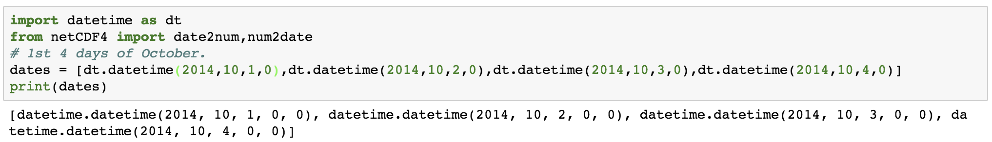
Now, let us write some data to the time variable using the datetime module of Python and the date2num function of netCDF4.
import datetime as dtfrom netCDF4 import date2num,num2datedates = [dt.datetime(2014,10,1,0),dt.datetime(2014,10,2,0),dt.datetime(2014,10,3,0),dt.datetime(2014,10,4,0)]print(dates)
times = date2num(dates, time.units)print(times, time.units) # numeric values
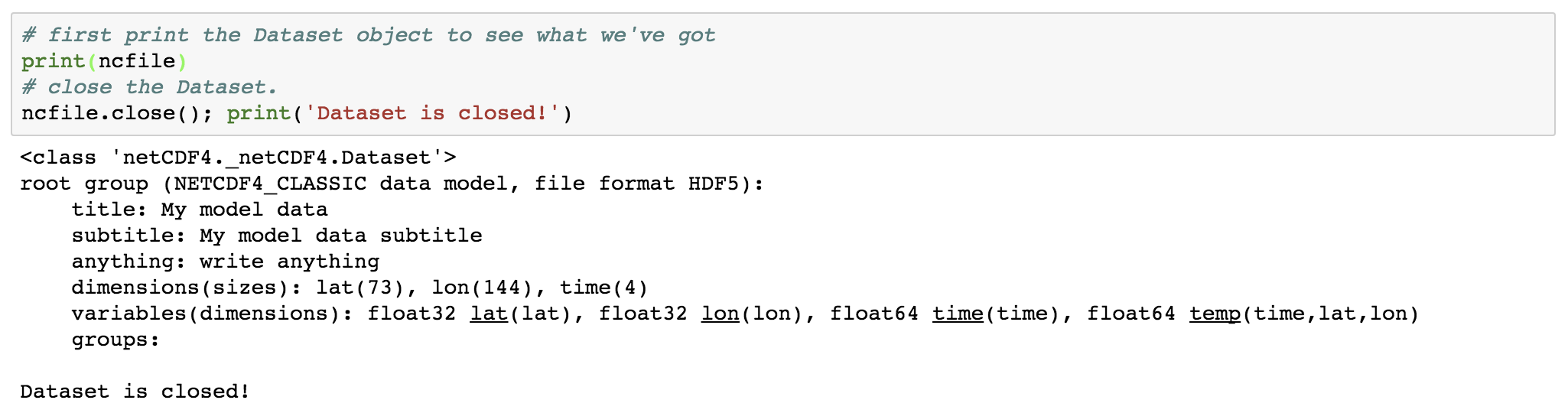
Now, it’s important to close the netCDF file which has been opened previously. This flushes buffers to make sure all the data gets written. It also releases the memory resources used by the netCDF file.
# first print the Dataset object to see what we've gotprint(ncfile)# close the Dataset.ncfile.close(); print('Dataset is closed!')
In Earth Sciences, we often deal with multidimensional data structures such as climate data, GPS data. It ‘s hard to save such data in text files as it would take a lot of memory as well as it is not fast to read, write and process it. One of the best tools to deal with such data is netCDF4. It stores the data in the HDF5 format (Hierarchical Data Format). The HDF5 is designed to store a large amount of data. NetCDF is the project hosted by Unidata Program at the University Corporation for Atmospheric Research (UCAR).
Here, we learn how to read and write netCDF4 data. We follow the workshop by Unidata. You can check out the website of Unidata.
Requirements:
Python3:
You can install Python3 via the Anaconda platform. I would recommend Miniconda over Anaconda because it is more light and installs only fundamental requirements for Python.
NetCDF4 Package:
conda install -c conda-forge netcdf4
Reading NetCDF data:
Now, we are good to go. Let’s see how we can read a netCDF data. The netCDF data has the extension of “.nc”
Importing NetCDF and Numpy ( a Python library that supports large multi-dimensional arrays or matrices):
import netCDF4import numpy as np
Now, let us open a NetCDF Dataset object:
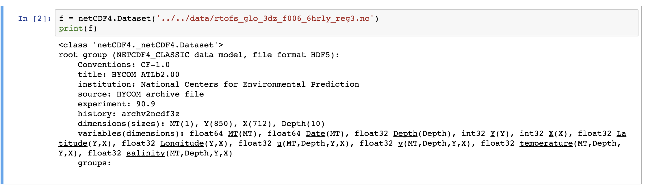
f = netCDF4.Dataset('../../data/rtofs_glo_3dz_f006_6hrly_reg3.nc')
Here, we have read a NetCDF file “rtofs_glo_3dz_f006_6hrly_reg3.nc”. When we print the object “f”, then we can notice that it has a file format of HDF5. It also has other information regarding the title, institution, etc for the data. These are known as metadata.
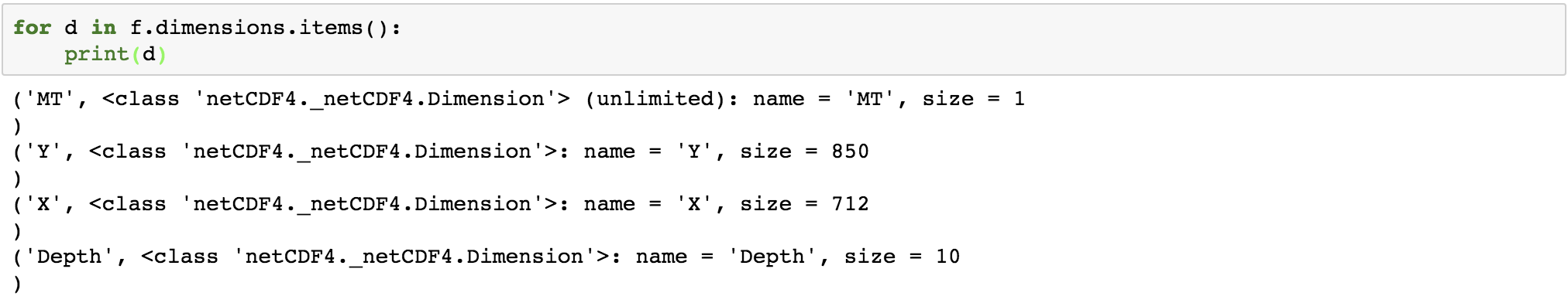
In the end of the object file print output, we see the dimensions and variable information of the data set. This dataset has 4 dimensions: MT (with size 1), Y (size: 850), X (size: 712), Depth (size: 10). Then we have the variables. The variables are based on the defined dimensions. The variables are outputted with their data type such as float64 MT (dimension: MT).
Some variables are based on only one dimension while others are based on more than one. For example, “temperature” variable relies on four dimensions – MT, Depth, Y, X in the same order.
We can access the information from this object, “f” just like we read a dictionary in Python.
print(f.variables.keys()) # get all variable names
This outputs the names of all the variables in the read netCDF file referenced by “f” object.
We can also individually access each variable:
temp = f.variables['temperature'] # temperature variableprint(temp)
The “temperature” variable is of the type float32 and has 4 dimensions – MT, Depth, Y, X. We can also get the other information (meta-data) like the coordinates, standard name, units of the variable. Coordinate variables are the 1D variables that have the same name as dimensions. It is helpful in locating the values in time and space. The unit of temperature variable data is “degC”. The current shape gives the information about the shape of this variable. Here, it has the shape of (1, 10, 850, 712) for each dimension.
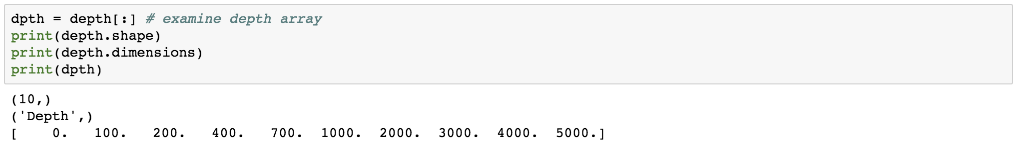
We can also check the dimension size of this variable individually:
for d in f.dimensions.items():print(d)
The first dimension “MT” has the size of 1, but it is of unlimited type. This means that the size of this dimension can be increased indefinitely. The size of the other dimensions is fixed.
For just finding the dimensions supporting the “temperature” variable:
temp.dimensions
temp.shape
Similarly, we can also inspect the variables associated with each dimension:
Here, we obtain the information about each of the four dimensions. The “MT” dimension, which is also a variable has a long name of “time” and units of “days since 1900-12-31 00:00:00”. The four dimensions denote the four axes, namely- MT: T, Depth: Z, X:X, Y: Y.
Now, how do we access the data from the NetCDF variable we have just read. The NetCDF variables behave similarly to NumPy arrays. NetCDF variables can also be sliced and masked.
We can also apply conditionals on the slicing of the netCDF variable:
xx,yy = x[:],y[:]print('shape of temp variable: %s' % repr(temp.shape))tempslice = temp[0, dpth > 400, yy > yy.max()/2, xx > xx.max()/2]print('shape of temp slice: %s' % repr(tempslice.shape))
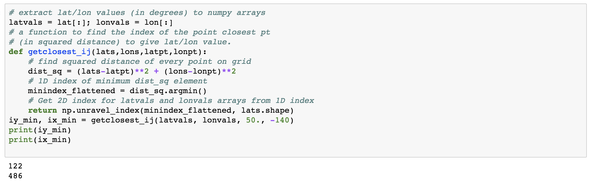
Now, let us address one question based on the given dataset. “What is the sea surface temperature and salinity at 50N and 140W?”
Our dataset has the variables temperature and salinity. The “temperature” variable represents the sea surface temperature (see the long name). Now, we have to access the sea-surface temperature and salinity at a given geographical coordinates. We have the variables latitude and longitude as well.
The X and Y variables do not give the geographical coordinates. But we have the variables latitude and longitude as well.
lat, lon = f.variables['Latitude'], f.variables['Longitude']print(lat)print(lon)print(lat[:])
Great! So we can access the latitude and longitude data. Now, we need to find the array index, say iy and ix such that Latitude[iy, ix] is close to 50 and Longitude[iy, ix] is close to -140. We can find out the index by defining a function:
# extract lat/lon values (in degrees) to numpy arrayslatvals = lat[:]; lonvals = lon[:] # a function to find the index of the point closest pt# (in squared distance) to give lat/lon value.def getclosest_ij(lats,lons,latpt,lonpt): # find squared distance of every point on grid dist_sq = (lats-latpt)**2 + (lons-lonpt)**2 # 1D index of minimum dist_sq element minindex_flattened = dist_sq.argmin() # Get 2D index for latvals and lonvals arrays from 1D index return np.unravel_index(minindex_flattened, lats.shape)iy_min, ix_min = getclosest_ij(latvals, lonvals, 50., -140)print(iy_min)print(ix_min)
So, now we have all the information required to answer the question.
sal = f.variables['salinity']# Read values out of the netCDF file for temperature and salinityprint('%7.4f %s' % (temp[0,0,iy_min,ix_min], temp.units))print('%7.4f %s' % (sal[0,0,iy_min,ix_min], sal.units))
Accessing the Remote Data via openDAP:
We can access the remote data seamlessly using the netcdf4-python API. We can access via the DAP protocol and DAP servers, such as TDS.
For using this functionality, we require the additional package “siphon”:
conda install -c unidata siphon
Now, let us access one catalog data:
from siphon.catalog import get_latest_access_urlURL = get_latest_access_url('http://thredds.ucar.edu/thredds/catalog/grib/NCEP/GFS/Global_0p5deg/catalog.xml', 'OPENDAP')gfs = netCDF4.Dataset(URL)
# Look at metadata for a specific variable
# gfs.variables.keys() #will show all available variables.
print("========================")
sfctmp = gfs.variables['Temperature_surface']
# get info about sfctmp
print(sfctmp)
print("==================")
# print coord vars associated with this variablefor dname in sfctmp.dimensions: print(gfs.variables[dname])
# flip the data in latitude so North Hemisphere is up on the plotsoilm = soilmvar[0,0,::-1,:] print('shape=%s, type=%s, missing_value=%s' % \ (soilm.shape, type(soilm), soilmvar.missing_value))
import matplotlib.pyplot as plt%matplotlib inlinecs = plt.contourf(soilm)
Here, the soil moisture has been illustrated on the land only. The white areas on the plot are the masked values.
Dealing with Dates and Times
The time variables are usually measured relative to a fixed date using a certain calendar. The specified units are like “hours since YY:MM:DD hh:mm:ss”.
from netCDF4 import num2date, date2num, date2indextimedim = sfctmp.dimensions[0] # time dim nameprint('name of time dimension = %s' % timedim)
Time is usually the first dimension.
times = gfs.variables[timedim] # time coord varprint('units = %s, values = %s' % (times.units, times[:]))
dates = num2date(times[:], times.units)print([date.strftime('%Y-%m-%d %H:%M:%S') for date in dates[:10]]) # print only first ten...
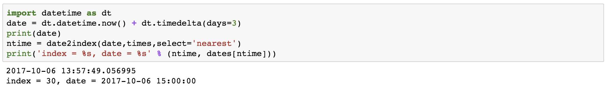
We can also get the index associated with the specified date and forecast the data for that date.
import datetime as dtdate = dt.datetime.now() + dt.timedelta(days=3)print(date)ntime = date2index(date,times,select='nearest')print('index = %s, date = %s' % (ntime, dates[ntime]))
This gives the time index for a time nearest to 3 days from today, current time.
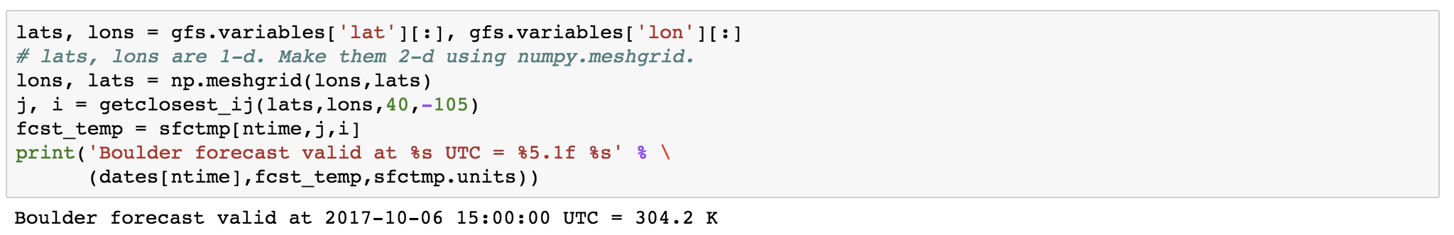
Now, we can again make use of the previously defined “getcloset_ij” function to find the index of the latitude and longitude.
lats, lons = gfs.variables['lat'][:], gfs.variables['lon'][:]# lats, lons are 1-d. Make them 2-d using numpy.meshgrid.lons, lats = np.meshgrid(lons,lats)j, i = getclosest_ij(lats,lons,40,-105)fcst_temp = sfctmp[ntime,j,i]print('Boulder forecast valid at %s UTC = %5.1f %s' % \ (dates[ntime],fcst_temp,sfctmp.units))
So, we have the forecast for 2017-10-06 15 hrs. The surface temperature at boulder is 304.2 K.
Simple Multi-file Aggregation
If we have many similar data, then we can aggregate them as one. For example, if we have the many netCDF files representing data for different years, then we can aggregate them as one.
Multi-File Dataset (MFDataset) uses file globbing to patch together all the files into one big Dataset.
Limitations:- It can only aggregate the data along the leftmost dimension of each variable.
It can only aggregate the data along the leftmost dimension of each variable.
only works with NETCDF3, or NETCDF4_CLASSIC formatted files.
Signals can be any time-varying or space-varying quantity. Examples: speech, temperature readings, seismic data, stock price fluctuations.
A signal has one or more frequency components in it and can be viewed from two different standpoints: time-domain and frequency domain. In general, signals are recorded in time-domain but analyzing signals in frequency domain makes the task easier. For example, differential and convolution operations in time domain become simple algebraic operation in the frequency domain.
Fourier Transform of a signal:
We can go between time-domain and frequency domain by using a tool called Fourier transform.
Now get comfortable with Fourier transform, let’s take an example in MATLAB:
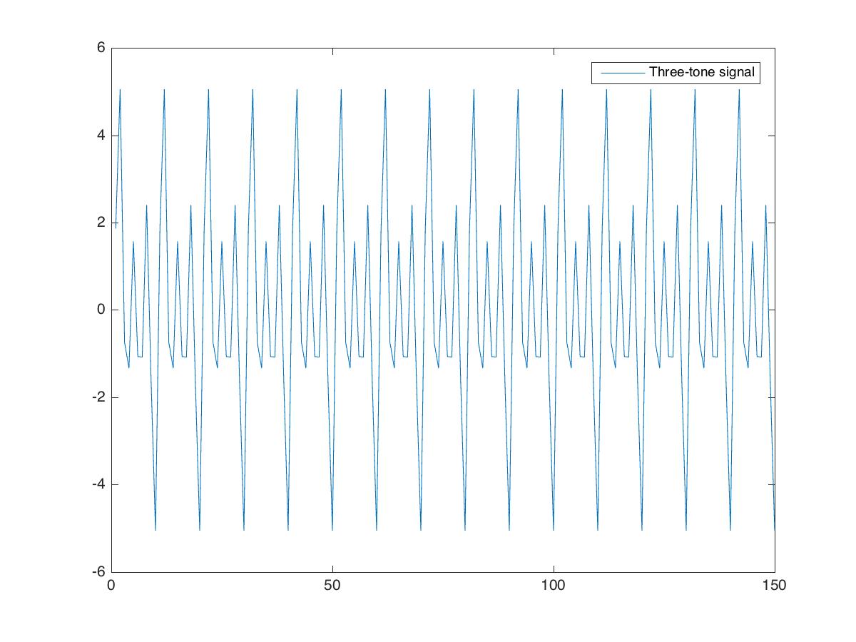
clear; close all; clc%%Creating datasetfs=100; %sampling frequency (samples/sec)t=0:1/fs:1.5-1/fs;%timef1=10; %frequency1f2=20; %frequency2f3=30; %frequency3x=1*sin(2*pi*f1*t+0.3)+2*sin(2*pi*f2*t+0.2)+3*sin(2*pi*f3*t+0.4);
We represent the signal by the variable . It is the summation of three sinusoidal signals with different amplitude, frequency and phase shift. We plot the signal first.
Power spectrum estimation using the Welch’s method:
Now we compute the power spectrum of the using the Welch’s method. We can use the function “pwelch” in Matlab to obtain the desired result.
pwelch(x,[],[],[],fs) %one-sided power spectral density
saveas(gcf,'power_spectral_plot.jpg')
Pwelch is a spectrum estimator. It computes an averaged squared magnitude of the Fourier transform of a signal. In short, it computes a set of smaller FFTs (using sliding windows), computes the magnitude square of each and averages them.
By default, $latex x$ is divided into the longest possible segments to obtain as close to but not exceed 8 segments with 50% overlap. Each segment is windowed with a Hamming window. The modified periodograms are averaged to obtain the PSD estimate. If you cannot divide the length of $latexx$ exactly into an integer number of segments with 50% overlap, $ latex x$ is truncated accordingly.
Note the peak at 10, 20 and 30 Hz. Also, note the display default for Pwelch is in dB (logarithmic).
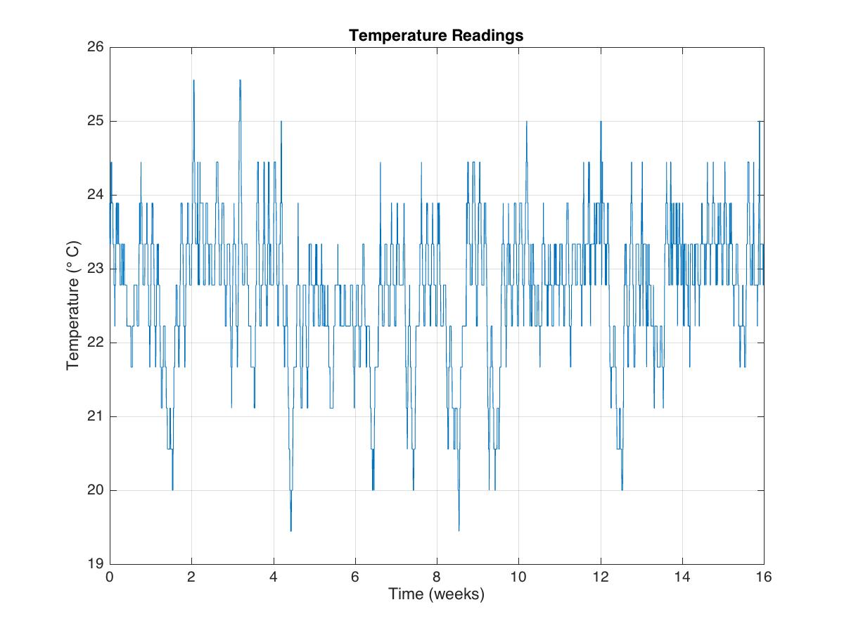
Let us inspect another data using the “pwelch” function of the Matlab.
tempnorm=tempC-mean(tempC); %temperature residualfs=2*24*7; %2 samples per hourfigure(2);pwelch(tempnorm,[],[],[],fs);axis([0 16 -30 0])xlabel('Occurrence/week')saveas(gcf,'power_spectral_tempReadings.jpg')
Resolving two close frequency components using “pwelch”:
Let’s first plot the data (having the frequency components at 500 and 550 Hz) using the default parameters of “pwelch” function:
clear; close all; clcload winLen;%%pwelch(s,[],[],[],Fs);title('pwelch with default input- f1: 500Hz, f2: 550Hz')set(gca,'YLim',[-120,0])set(gca,'XLim',[0,5])saveas(gcf,'pwelchDefaultPlot.jpg')
Here, we can see that the frequency component at 500Hz can be resolved but the frequency component at 550 Hz is barely visible.
One can obtain better frequency resolution by increasing the window size:
figure;filename = 'pwelchWindowAnalysis.gif';for len=500:300:N pwelch(s,len,[],len,Fs); title(sprintf('Hamming Window size: %d',len)) set(gca,'YLim',[-120,0]) set(gca,'XLim',[0,1]) drawnow; frame = getframe(1); im = frame2im(frame); [imind,cm] = rgb2ind(im,256); if len == 500; imwrite(imind,cm,filename,'gif', 'Loopcount',inf); else imwrite(imind,cm,filename,'gif','WriteMode','append'); endend
Here, we can see that by increasing the window width, we can resolve the two components. By increasing the window width, we lose the temporal resolution but at the same time, we gain the spectral resolution.
Resolving the frequency component using the Kaiser window:
“pwelch” function uses Hamming window by default.
L = 64;
wvtool(hamming(L))
Because of the inherent property of the Hamming window (fixed side lobe), sometimes the signal can get masked.
clear; close all; clcload winType;figure;pwelch(s,[],[],[],Fs);title('pwelch with default input- f1: 500Hz, f2: 5kHz')set(gca,'YLim',[-90,0])set(gca,'XLim',[0,10])saveas(gcf,'pwelchComplexDefaultPlot.jpg')
In the above figure, we can see that the frequency component of the signal at 5kHz is barely distinguishable.
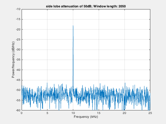
To resolve this component of frequency, we use Kaiser window instead of the default Hamming window.
Kaiser Window in Frequency domain
Kaiser Window in time domain
% %% Kaiser windowfigure;len=2050;h1=kaiser(len,4.53); %side lobe attenuation of 50dBpwelch(s,h1,[],len,Fs);title('Kaiser window with 50dB side lobe attenuation')saveas(gcf,'pwelchComplexKaise50dBsidelobe.jpg')% %% Kaiser windowfigure;len=2050;h2=kaiser(len,12.26); %side lobe attenuation of 50dBpwelch(s,h2,[],len,Fs);title('Kaiser window with 120dB side lobe attenuation')saveas(gcf,'pwelchComplexKaise120dBsidelobe.jpg')
To obtain a Kaiser window that designs an FIR filter with sidelobe attenuation of α dB, we use the following β :
kaiser(len,beta)
Amplitude of one frequency component is much lower than the other:
We can have some signal where the amplitude of one frequency component is much lower than the others and is inundated in noise.
To deal with such signals, we need to get rid of the noise using the averaging of the window.
clear; close all; clcload winAvg; % %% Kaiser windowfigure;len=2050;h1=kaiser(len,4.53); %side lobe attenuation of 50dBpwelch(s,h1,[],len,Fs);set(gca,'XLim',[8,18]);set(gca,'YLim',[-60,-20]);title('Kaiser window with 50dB side lobe attenuation')saveas(gcf,'pwelchAvgComplexKaise50dBsidelobe.jpg')
In the above signal plot, the second frequency component at 14kHz is undetectable. We can get rid of the noise using the averaging approach.
figure;filename = 'pwelchAveraging.gif';for len=2050:-100:550 h2=kaiser(len,4.53); %side lobe attenuation of 50dB pwelch(s,h2,[],len,Fs); drawnow; frame = getframe(1); im = frame2im(frame); [imind,cm] = rgb2ind(im,256); if len == 2050; imwrite(imind,cm,filename,'gif', 'Loopcount',inf); else imwrite(imind,cm,filename,'gif','WriteMode','append'); endend
Here, we take the smaller window in steps to show the effect of averaging. Smaller window in frequency domain is equivalent to the larger window in time domain.
Dealing with data having missing samples:
clear; close all; clc%%Signals having missing samplesload weightData;plot(1:length(wgt),wgt,'LineWidth',1.2)ylabel('Weight in kg'); xlabel('Day of the year')grid on; axis tight; title('Weight readings of a person')saveas(gcf,'weightReading.jpg')
In case, we have missing samples in the data, i.e., the data is not regularly recorded, then we cannot apply the “pwelch” function of matlab to retrieve its frequency components. But thankfully, we have the function “plomb” which can be applied in such cases.
figure;[p,f]=plomb(wgt,7,'normalized');plot(f,p)xlabel('Cycles per week');ylabel('Magnitude')grid on; axis tightsaveas(gcf,'plombspectrum.jpg')
Analyzing time and frequency domain simultaneously:
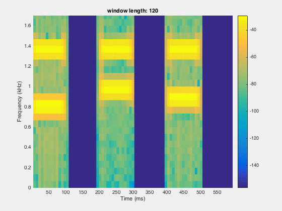
Sometimes, we need the time and frequency informations simultaneously. For a long series of data, we need to know which frequency component is recorded first and at what time. This can be done by making the spectrogram.
clear; close all; clcload dtmf;%%figure;pwelch(x,[],[],[],Fs)saveas(gcf,'powerspectrum_dtmf.jpg')
% %%figure;spectrogram(x,[],[],[],Fs,'yaxis'); colorbar; %default window is hamming windowsaveas(gcf,'spectrogramDefault_dtmf.jpg')
Since, the time resolution is higher for smaller window and frequency resolution is lower at small window length. So there is the trade off between the time and frequency domain window length. We need to figure out the optimal point for better resolution in both time and frequency domain.
segLen = [120, 240,480,600,800,1000,1200,1600]; figure;filename='spectrogramAnalysis.gif';for itr = 1:numel(segLen) spectrogram(x,segLen(itr),[],segLen(itr),Fs,'yaxis'); set(gca,'YLim',[0,1.7]); title(sprintf('window length: %d',segLen(itr))) colorbar; drawnow; frame = getframe(1); im = frame2im(frame); [imind,cm] = rgb2ind(im,256); if itr == 1; imwrite(imind,cm,filename,'gif', 'Loopcount',inf); else imwrite(imind,cm,filename,'gif','WriteMode','append'); end end
Doing statistical analysis in MATLAB is lot easier than other computer languages. Here, we can make use of the intrinsic “plot” to visualize the statistics of the data.
Below are some programs for commonly used statistical analysis:
Calculating mean, standard deviation, median etc of the data and visualizing the data using the histograms. Here, we do the example for a random normal and non-normal data. : Statistics 1


 . It is the summation of three sinusoidal signals with different amplitude, frequency and phase shift. We plot the signal first.